10 business intelligence dashboard examples that work
February 26, 2025
- min read
Henry Owen
Product Marketing Manger
Last Update: May 2026
Most businesses have more data than they know what to do with, and it piles up where it's hardest to use: customer data in the CRM, financial data in the accounting tool, operations data scattered across an ERP, an inventory system, and three spreadsheets someone built in 2019 that nobody wants to touch.
Business intelligence dashboards exist to fix that — pulling everything into one place, adding structure, and surfacing what matters — and they've come a long way from static reports. The best ones in 2026 are interactive, update in real time, and fold in capabilities that used to be separate products: AI BI that explains a movement rather than just charting it, conversational analytics that lets anyone ask a question in plain English, and a self-service analytics layer with predictive models like AI demand forecasting and AI churn prediction sitting on top.
This guide covers 10 dashboard types used across business functions, what makes each one actually useful, and where the gap between good and great tends to show up.
What separates useful dashboards from ignored ones
Before getting into specific examples, it's worth being clear about what makes dashboards work in practice. The ones that get used share a few qualities: they focus on a small number of metrics that people are actually making decisions from, they update automatically from source systems rather than requiring manual refreshes, and they're built on data that everyone trusts.
This is where the data foundation work matters. Kleene.ai data platform handles ingestion, transformation, and modeling across all of your source systems, so dashboards are always being fed from clean, consistent, analytics-ready data rather than whatever someone exported last Tuesday.
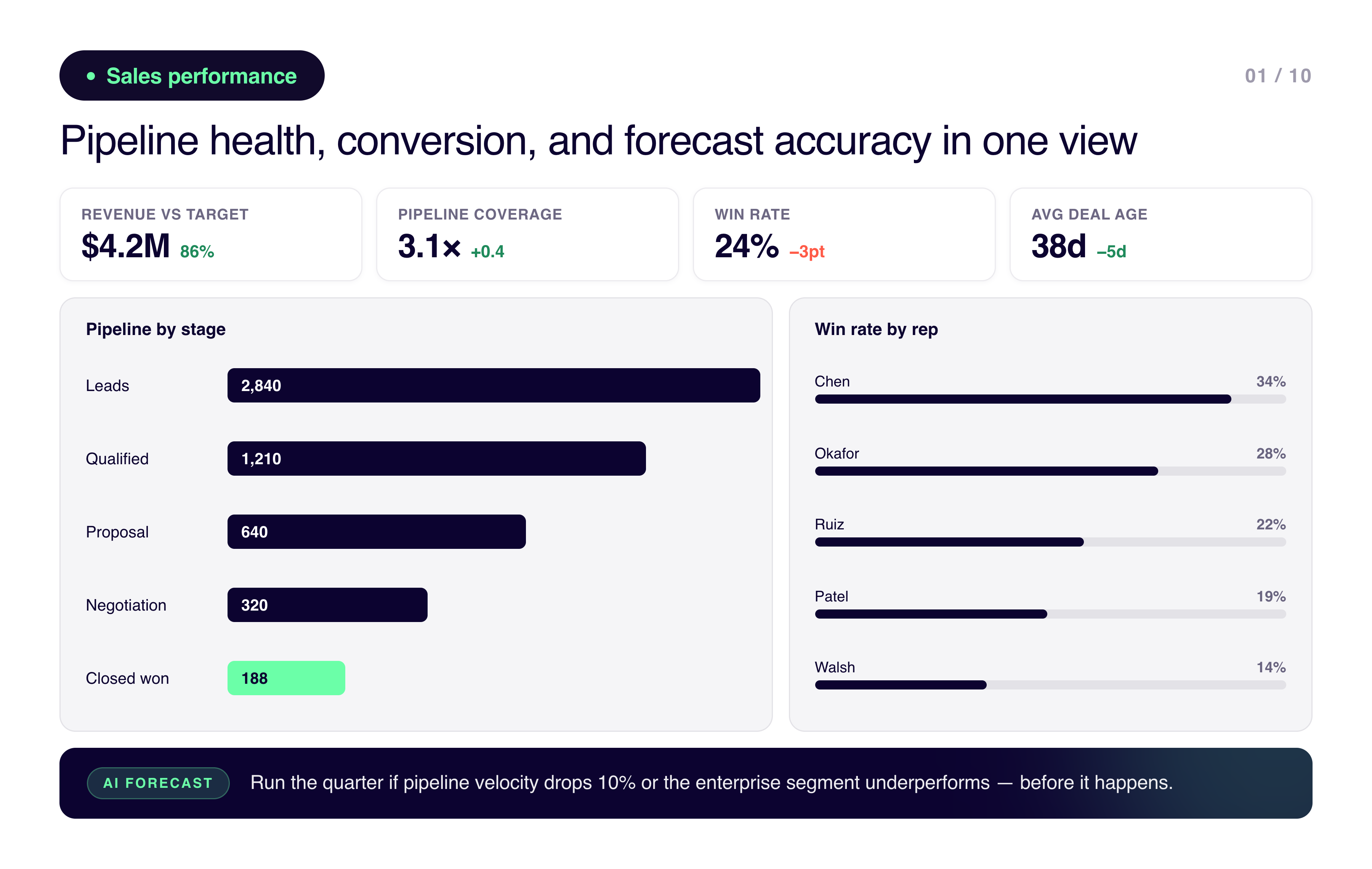
1. Sales performance dashboard
Sales performance dashboard
A sales performance dashboard gives revenue teams visibility into pipeline health, conversion rates, and how forecast accuracy is actually trending.
The metrics that matter most tend to be revenue against target, pipeline coverage and velocity, win rates by stage, and performance by rep, region, and product. Those are the things that tell you where the business is healthy and where it isn't before the end of quarter.
The reason these dashboards fail is usually that they're showing what happened to pipeline rather than what's likely to happen to revenue. Leading teams layer forecasting on top: what happens to revenue if pipeline velocity drops 10%? What does the quarter look like if the enterprise segment underperforms? Kleene.ai powers this by combining CRM, finance, and product data into a unified model that can run those scenarios rather than just showing the current state.
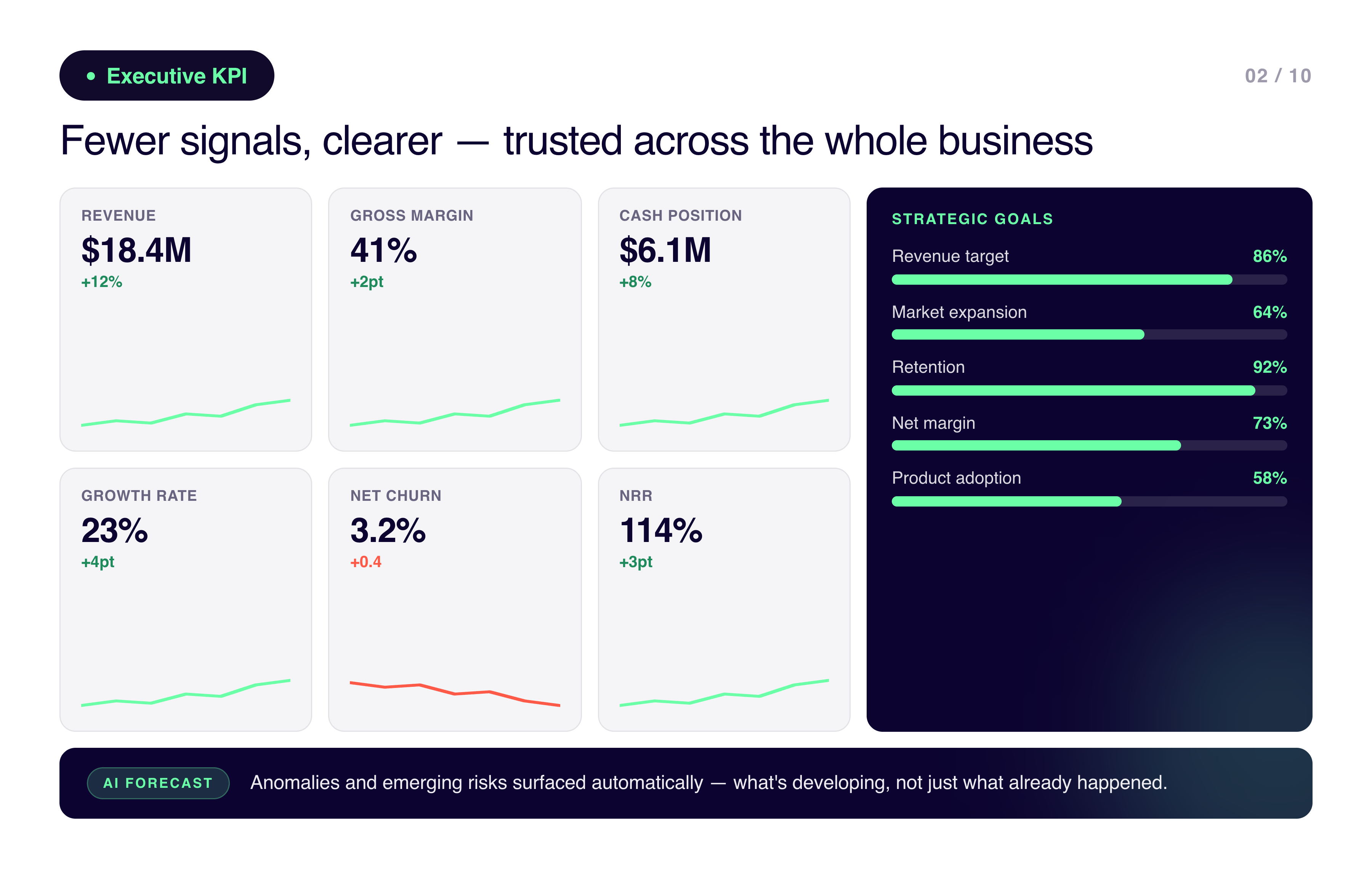
2. Executive KPI dashboard
Executive KPI dashboard
Executive dashboards are about speed and alignment. Leadership needs fewer signals, clearer, and ones they can trust across the whole business rather than department by department.
The usual suspects: revenue, margin, cash, growth rate, churn, strategic goal progress, and whatever risk indicators matter for the specific business. The goal is that someone can look at this for two minutes and know whether the business is on track or not.
Where most executive dashboards fall short is that they're still backward-looking. The good ones have AI surfacing anomalies and emerging risks automatically, so leadership is seeing what's developing rather than what already happened. Kleene.ai standardizes metrics across teams and applies intelligence models that surface what executives should be paying attention to next.
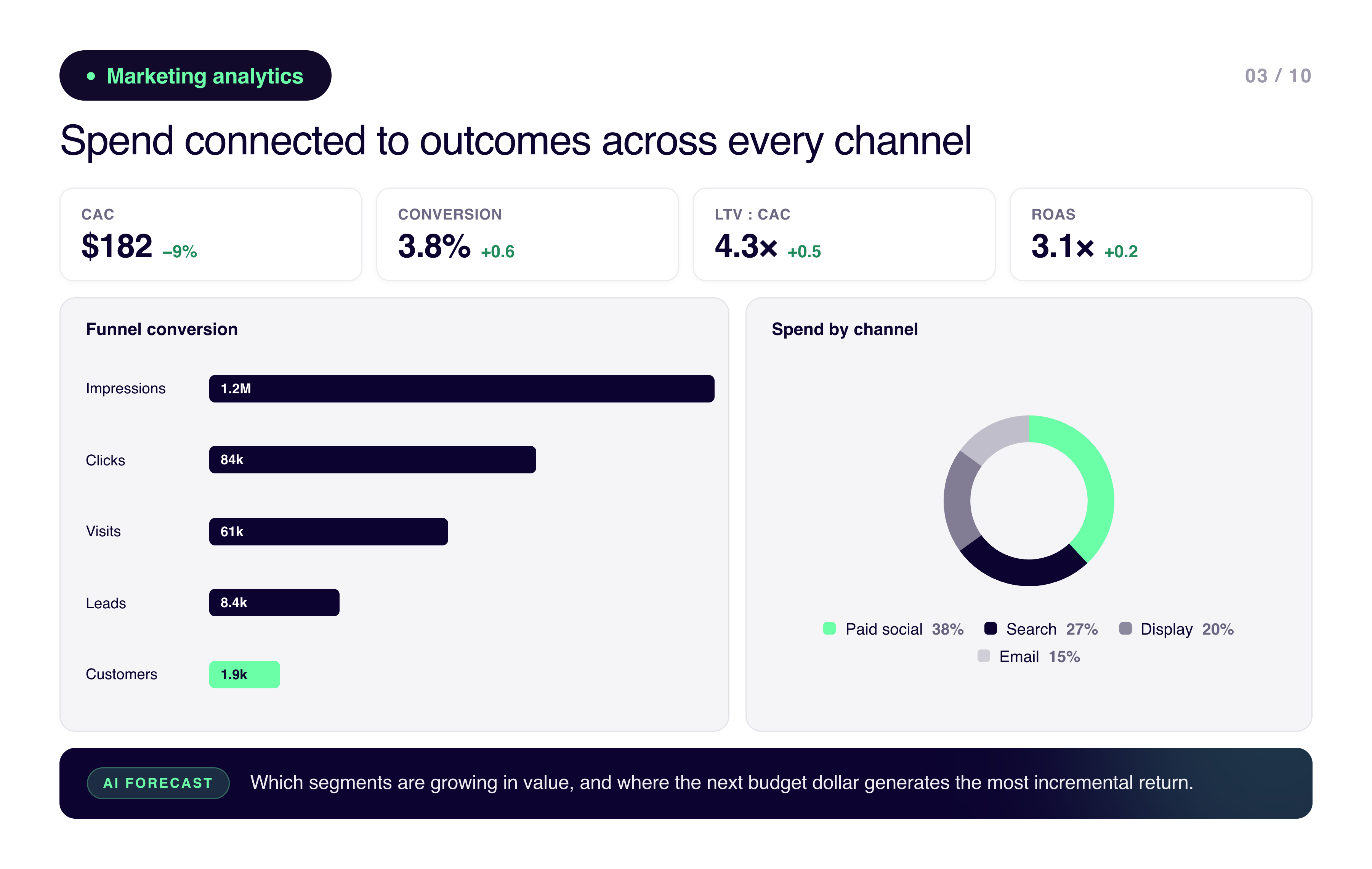
3. Marketing analytics dashboard
Marketing analytics dashboard
Marketing dashboards connect spend to outcomes, which sounds obvious but is genuinely hard when data is sitting separately in ad platforms, web analytics, CRM, and ecommerce systems. Without a unified view, teams end up optimizing channels in isolation and making budget decisions based on platform-reported attribution that tends to be optimistic.
The metrics worth tracking: campaign and channel performance, cost per acquisition, conversion rates across the funnel, attribution, and customer lifetime value by cohort.
The more useful version of this dashboard incorporates predictive insights. Which customer segments are growing in value? Where would additional budget generate the most incremental return? Kleene.ai enriches marketing data with finance and customer data to enable that kind of analysis rather than just channel-level reporting.
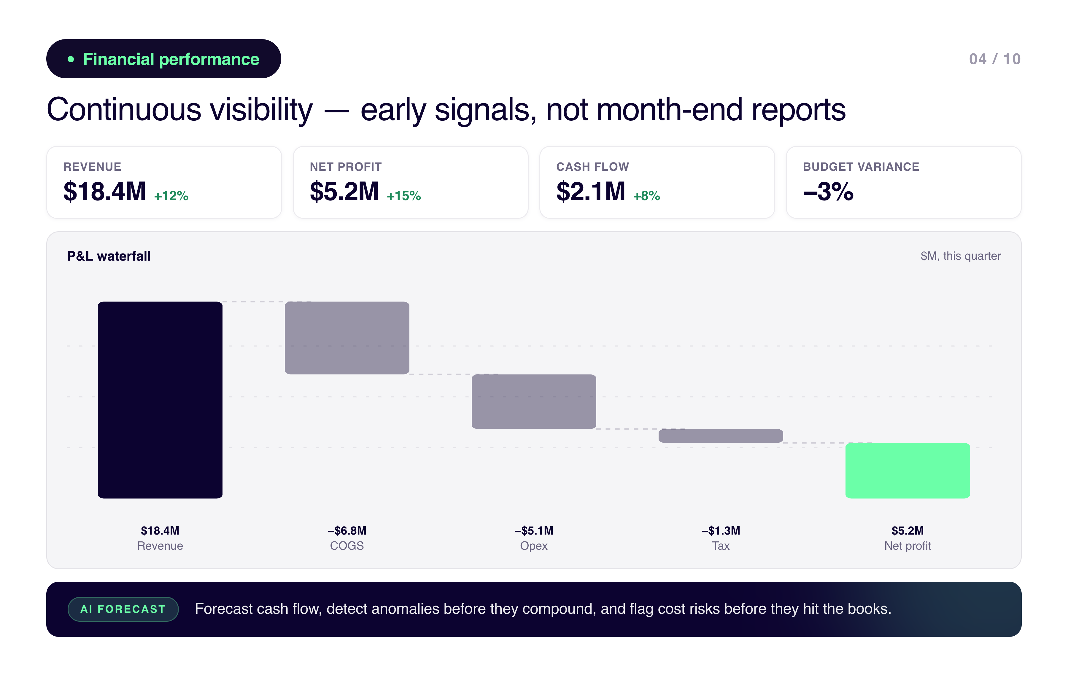
4. Financial performance dashboard
Financial performance dashboard
Finance dashboards replace static month-end reports with continuous visibility. P&L, cash flow, budget versus actuals, margin by product line or region, cost drivers, forecast trends. The goal is early signals rather than retrospective explanations.
The teams using these well aren't just reporting variance. They're using AI to forecast cash flow, detect anomalies before they compound, and highlight cost risks before they show up in the books. Kleene.ai enables finance teams to move from reporting to predictive planning without needing to build complex models or manage data infrastructure themselves.
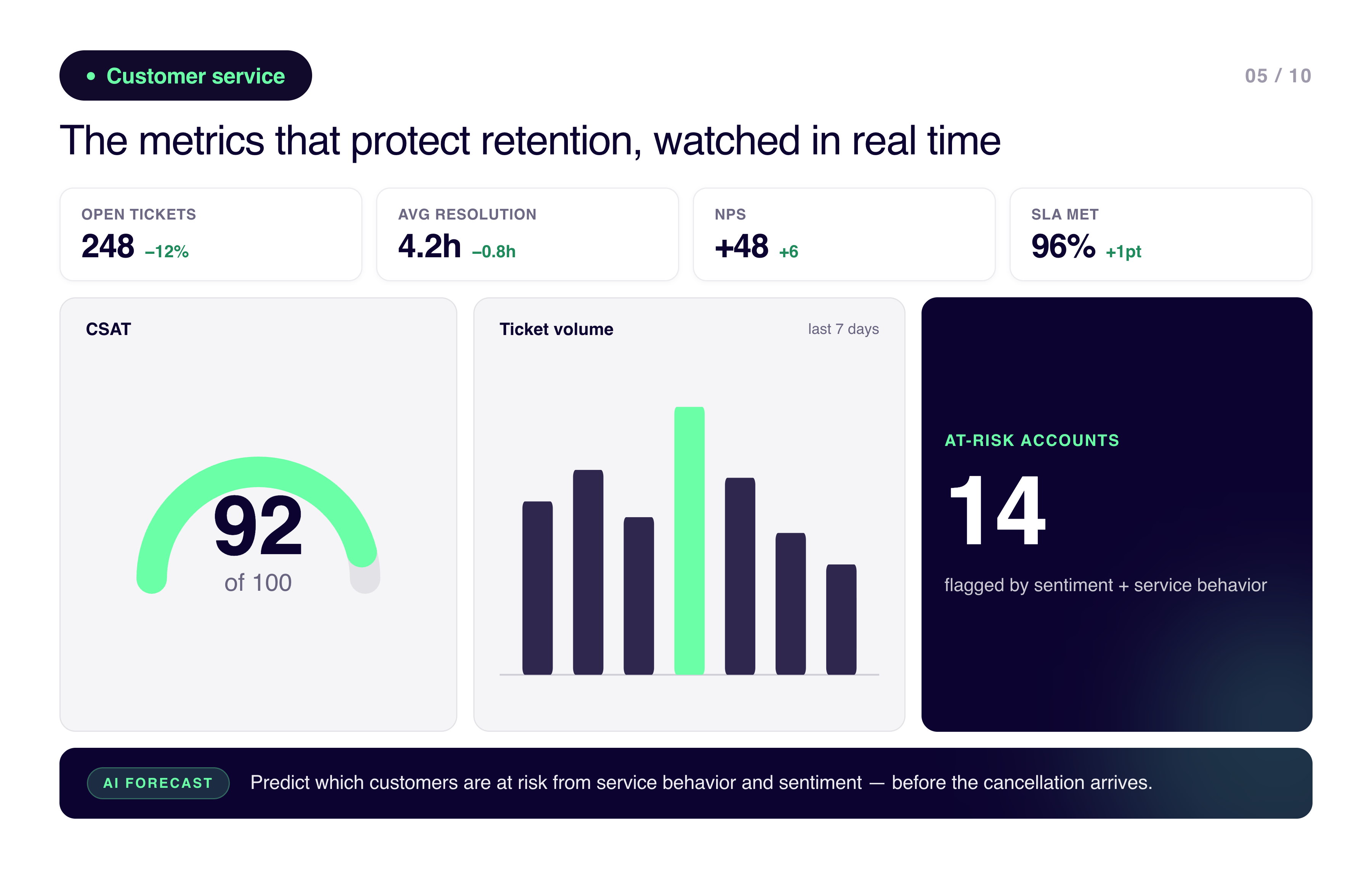
5. Customer service dashboard
Customer service dashboard
Customer service dashboards track the metrics that protect retention: ticket volume, response and resolution times, CSAT, NPS, SLA compliance, and agent productivity. The reason they matter is that support issues tend to surface before churn does.
The more sophisticated version uses AI to predict which customers are at risk based on service behavior and sentiment rather than waiting for the cancellation to arrive. Kleene.ai connects support, product, and customer data so service dashboards can inform retention strategy rather than just queue management.
6. HR analytics dashboard
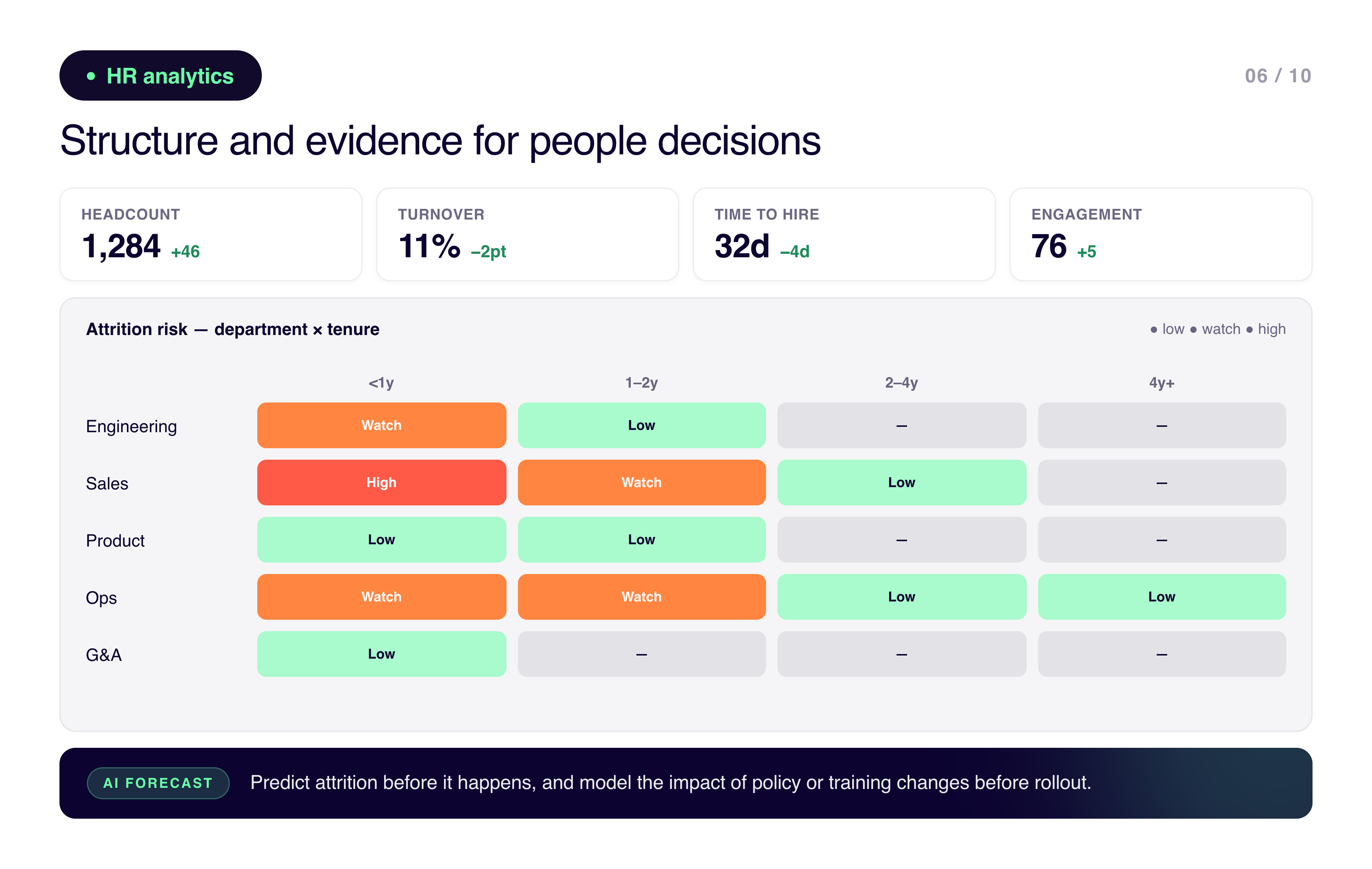
HR analytics dashboard
HR dashboards bring structure to people decisions. Headcount and turnover trends, hiring efficiency, performance patterns, engagement signals, diversity metrics. The evidence base for decisions that used to be made almost entirely on instinct.
Where this gets more interesting is predicting attrition before it happens and modeling the impact of policy or training changes before rolling them out. Kleene.ai allows HR teams to connect workforce data with financial and operational outcomes, so people decisions are evaluated against business performance rather than in a silo.
7. Supply chain dashboard
Supply chain dashboard
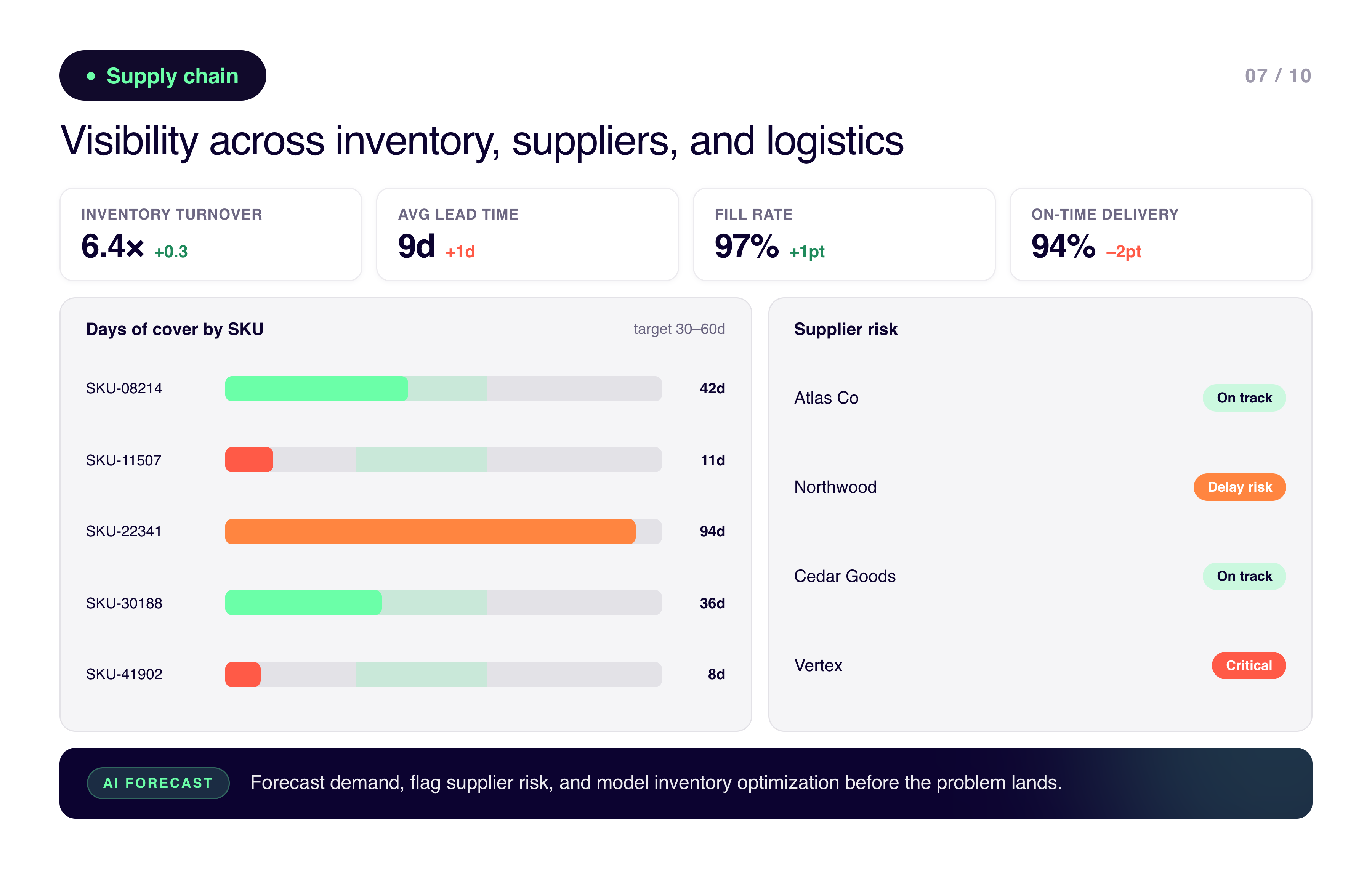
Supply chain dashboards give visibility across inventory, suppliers, and logistics. Inventory levels and turnover, supplier lead times, order fulfillment rates, cost and efficiency metrics, and risk indicators.
The thing about supply chain issues is that small delays compound fast. A dashboard that shows you what's already happening is useful. A dashboard that's forecasting demand, flagging supplier risk, and modeling inventory optimization before the problem lands is much more valuable. Kleene.ai supports this by combining sales, operations, and supplier data into a single intelligence layer that can surface those signals early.
8. Project management dashboard
Project management dashboard
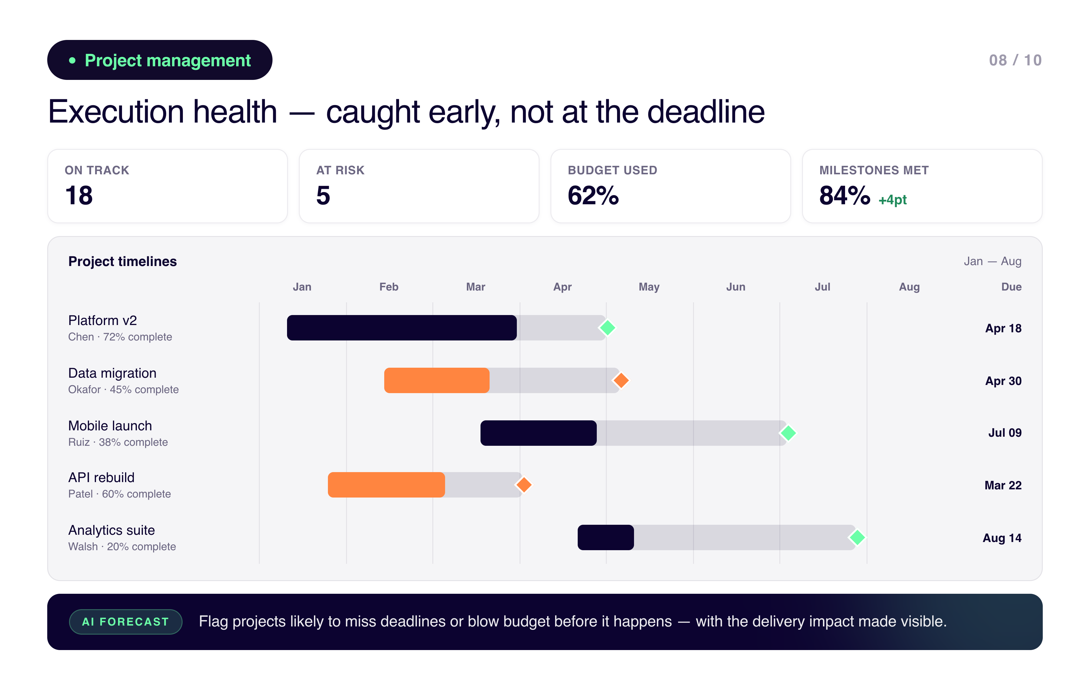
Project dashboards track execution health: timeline against milestones, budget versus spend, resource allocation, risks and dependencies. The goal is catching execution issues early rather than finding out at the deadline.
The more capable versions use AI to flag projects likely to miss deadlines or blow the budget before it happens. With Kleene.ai, project data can be analyzed alongside finance and operations so the actual delivery impact of delays is visible, not just the timeline slip.
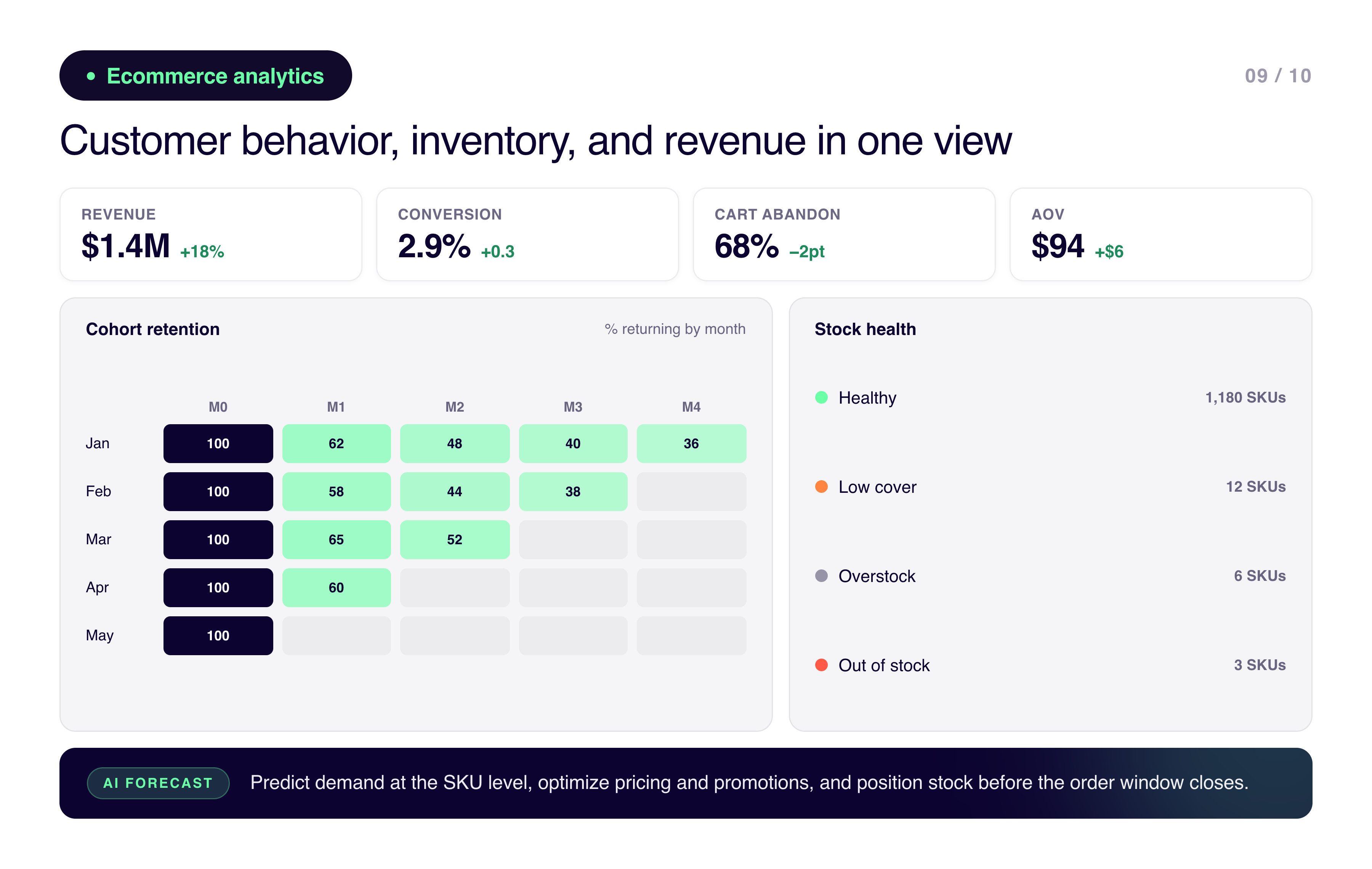
9. Ecommerce analytics dashboard
Ecommerce analytics dashboard
Ecommerce dashboards connect customer behavior with inventory and revenue. Sales and conversion rates, customer cohorts, inventory availability, cart abandonment, demand trends. Growth without inventory visibility tends to erode margin, which is why these two things need to be in the same view.
AI forecasting is particularly valuable here: predicting demand at the SKU level, optimizing pricing and promotions, and getting ahead of stock positioning before the order window closes. Kleene.ai enables ecommerce teams to move from descriptive reporting to predictive planning.
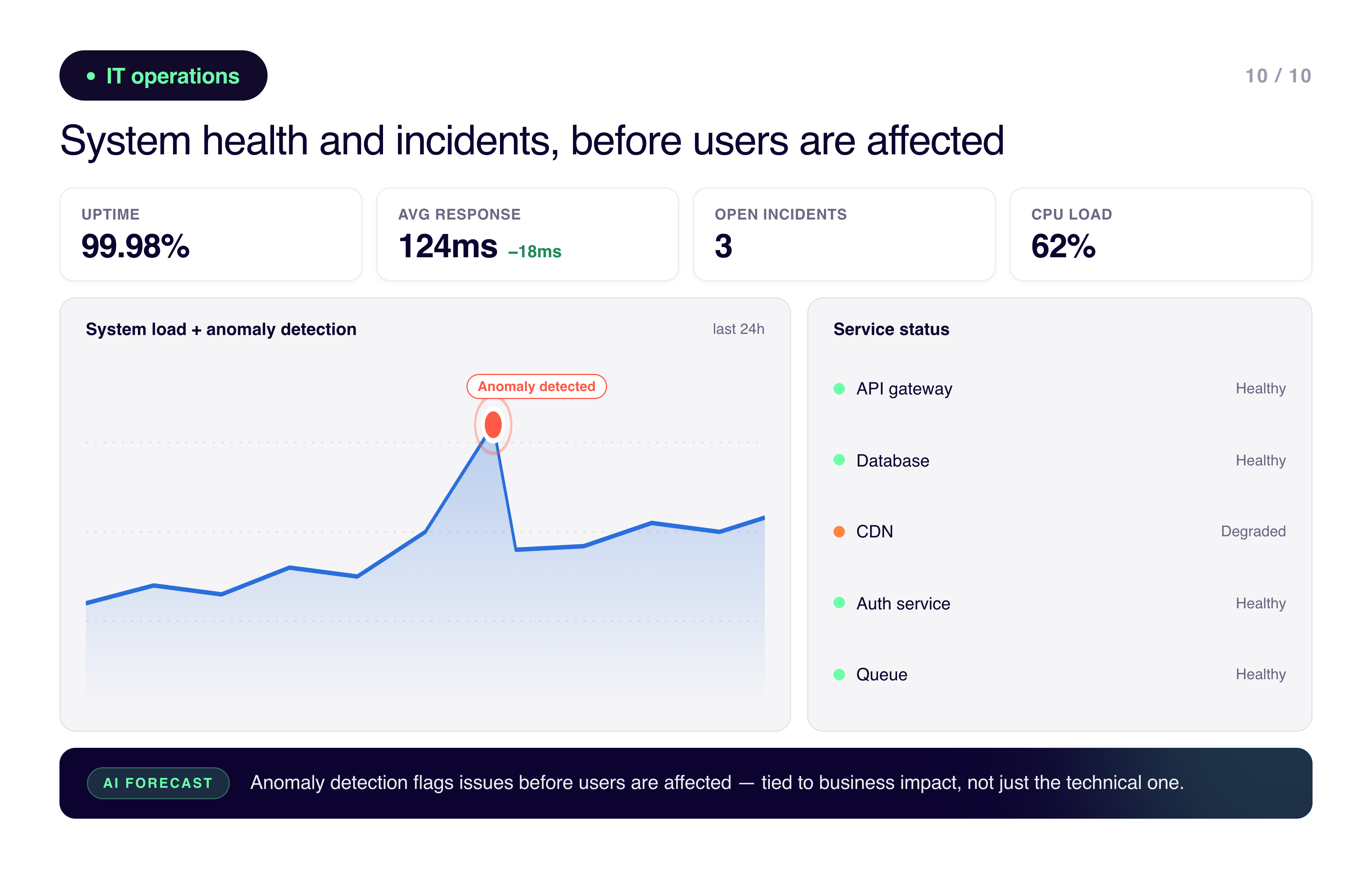
10. IT operations dashboard
IT operations dashboard
IT operations dashboards track system performance, network health, security events, resource utilization, and incident response. Downtime is expensive and usually preventable if the right signals are visible early enough.
AI-driven anomaly detection flags issues before users are affected. Kleene.ai can ingest infrastructure data alongside business metrics so teams understand the operational impact of IT events rather than just the technical ones.
From dashboards to decision intelligence
Dashboards tell you what happened. The useful next step is understanding what's likely to happen next and what to do about it.
That's the shift from BI to decision intelligence. Kleene.ai sits at that intersection: unifying data across the business, building analytics-ready pipelines, and applying AI models that surface forecasts, performance drivers, risks, and clear next steps. Dashboards remain the starting point. Kleene.ai makes them the foundation for something more useful than a view of last month.
If you're building dashboards today, a few things worth keeping in mind: anchor metrics to the decisions people are actually making, build on governed unified data from the start, design for clarity rather than completeness, and plan for AI from day one rather than trying to add it later. Dashboards shouldn't be the end of the journey. They should be the point where the real work starts.

%201.svg)


%201.svg)
